CASE STUDY: Splash Beverage Group
INDUSTRY: Beverages
The Ask

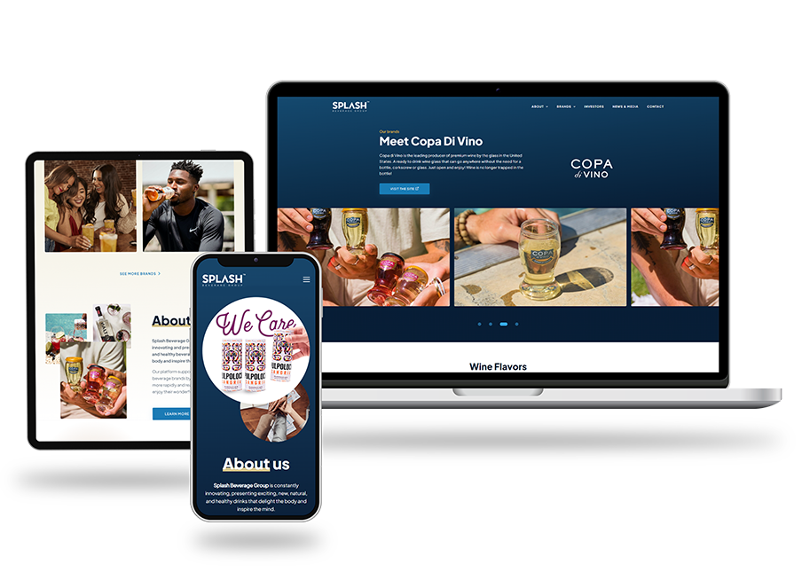
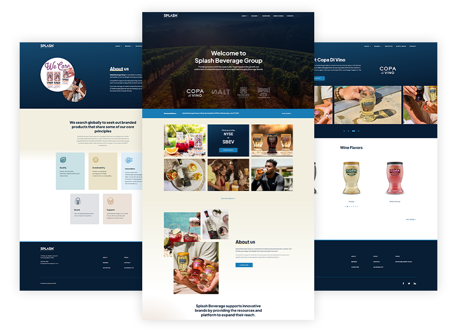
Splash’s President and CMO—a past client from another company—contacted us to help bring SPLASH branding and its site to the level of professionalism and UX/UI it was lacking. They approached us to create a site that told an immediate story of their portfolio of brands and was user friendly for the main audience of Institutional Investors. At first glance it needed to show the strength and breadth of the portfolio as well as the importance of how each brand is created from farm to retail and that each is about enhancing lifestyle.
The site needed to be visually appealing with easy to navigate links to the latest company news and their NYSE ticker. Splash’s Investor Relations site was built by a 3rd party for them, and closely matched the refreshed branding.
The site needed to be visually appealing with easy to navigate links to the latest company news and their NYSE ticker. Splash’s Investor Relations site was built by a 3rd party for them, and closely matched the refreshed branding.
Website Design + Brand Refresh

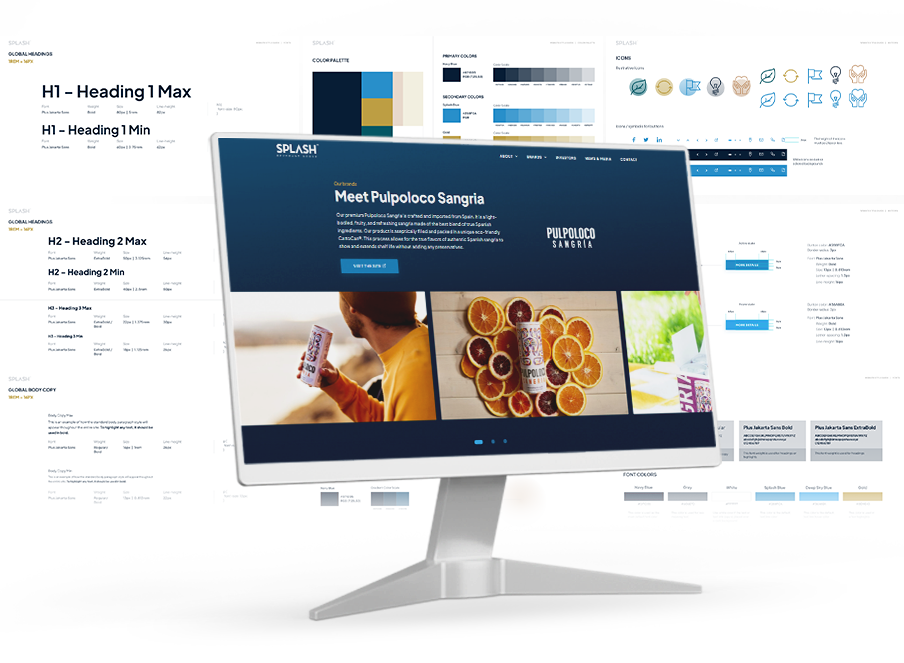
Splash came to the table with an existing logo and mark and a sole brand color which needed some TLC and extension. We simplified the logo which associated better with the Investor audience and added a more agile color palette and font guide that modernizes and creates the perfect accents to organize the website’s content.
Design and Development

Splash needed a modern functioning site, built in WordPress to allow them to scale up as time goes on and be able to add to the site’s content all while keeping lockstep with the cleanliness of the site’s visuals and easy navigation.


