CASE STUDY: Adcolor

INDUSTRY: Nonprofit
AN EXPERIENCE THAT MAKES IT EASY TO RISE UP & REACH BACK
User Experience

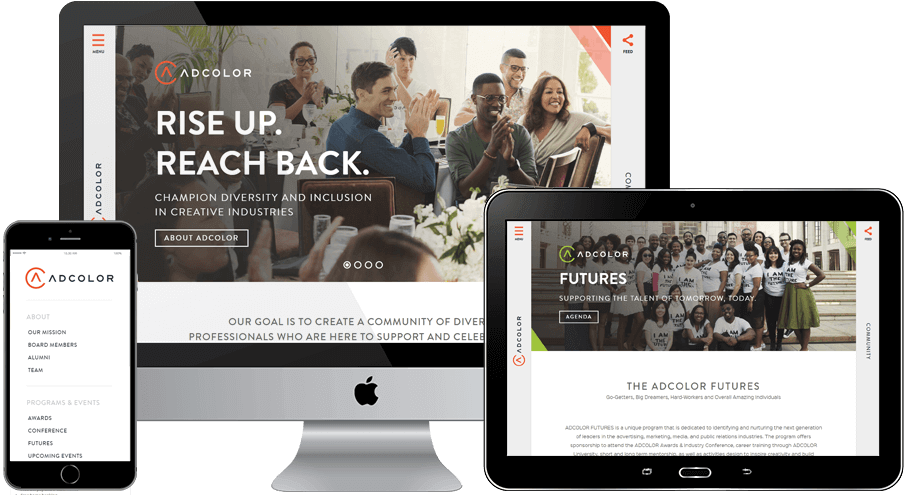
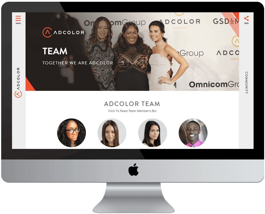
The ADCOLOR team came to Squeaky with the goal of showing the advertising community that they are much more than an annual conference – they are the premiere organization for advancing diversity and inclusion in the creative industries. It was our task to show new visitors exactly what ADCOLOR has to offer as well as to create a homebase for the existing ADCOLOR community. During our user experience process, we prioritized transforming their minimal, one-page website into a multi-page site that was home to an extensive amount of content but was still easy for the various audiences to navigate. We placed the main navigation on the left hand side to allow for easy expansion and visibility, and integrated a pop-out function for the social feeds on the right hand menu to highlight the every day achievements of the ADCOLOR community.
ADDING COLOR AND BRINGING IT TO LIFE
Website Design & Development

We worked very closely with ADCOLOR’s branding team to ensure that the new website worked in concert with the new brand identity. During this process, we bridged the gap between ADCOLOR’s offline and online presence and solved for any conflicts between print and digital assets. We customized third party plugins such as a social feed, event calendar and video page, to align with the brand guidelines and seamlessly fit within ADCOLOR’s website. Throughout the entire design and development process, it was essential for us to make sure that everything was streamlined and efficient so that the website would truly be able to help advance ADCOLOR's mission of creating a community of diverse professionals who are here to support and celebrate one another.


