CASE STUDY: Savoy

INDUSTRY: B2B
UX STRATEGY
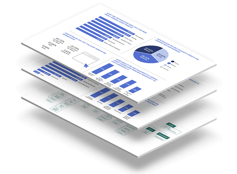
Savoy partners with brokers and carrier partners to provide a suite of health and benefit related services. With over 35 years in the business, Savoy takes a strategic approach that changes the way employers think about health insurance. To build an intuitive website for Savoy’s target audience, Squeaky partnered with Savoy on a thorough research process to extract relevant insights that would inform the most effective strategy to achieve the client’s objectives. As part of this, Squeaky conducted extensive user research to identify characteristics of their audience. This process included stakeholder interviews, user surveys, focus groups, data analytics and experience mapping. This research report served as the foundation for Squeaky to identify different user personas, build the user flow chart and information architecture, and develop wireframes that became the website’s blueprint.
UI & DESIGN SYSTEM
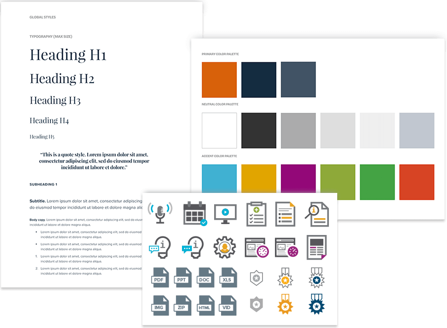
With a focus on usability, Squeaky set out to create a responsive design that worked seamlessly across all platforms. This was especially challenging given the set of tools and functionality necessary for a seamless integration that supported the audience’s business needs. It was important that all content and tools were consistent and readily available on the go regardless of device or screen size. Visual prompts through colors, imagery, and icons extended Savoy branding resulting in a design system that was applicable for all digital platforms and provided a consistent look and feel across all of communications.
CONTENT STRATEGY
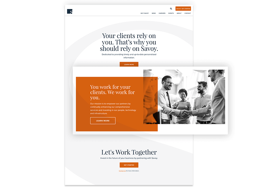
Through a thorough content audit process across various touch points, Squeaky streamlined the most relevant information for Savoy’s audience. The key objective of saving brokers valuable time while providing premium, easy to find content that met their needs. Information was served directly to a brokers personalized dashboard while also compartmentalizing content throughout in an intuitive and accessible way.
CUSTOMIZED MARKETING MATERIALS
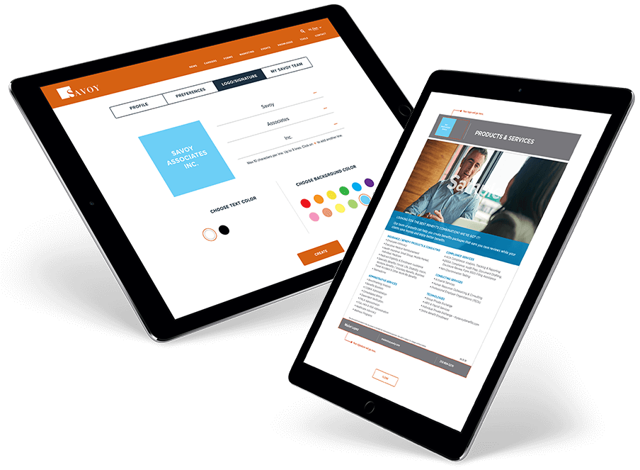
A significant concentration was to develop new and enhanced ways to empower the broker with the ability to service their clients. A prized piece was the customization of marketing materials to support broker client communication. This tool provided the ability to filter and customize various types of content (images, PDFs, PowerPoint, etc.) with individual brokers branding and information. This tool allowed brokers to focus on their core business while Savoy took an omnipresent supporting role.
ENTERPRISE CMS
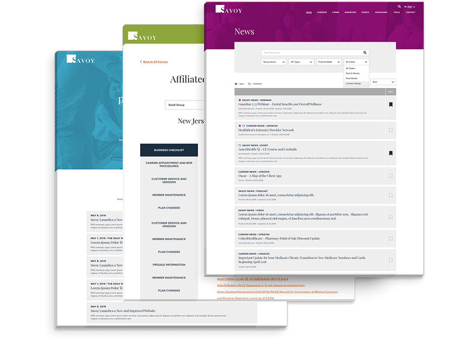
Squeaky leveraged Kentico 12 CMS and the latest features to develop a website that the marketing team could fully control without having to rely on their technology department for the day to day needs of the company. Squeaky worked closely with Savoy to ensure the Kentico CMS met their needs for regular updates from editing to adding new content. Squeaky made use of Kentico Widgets, WYSIWYG functions and customized modules that incorporated enough flexibility while maintaining the established aesthetics of the site.
CONTENT MIGRATION
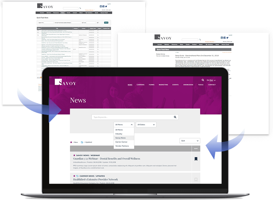
The client’s site contained over 10 years of vital data with thousands of articles and pieces of assets that needed to be a part of the new site. A series of custom migration module that mapped to the new database were put in place to allow Savoy to perform several migrations over the course of a couple of months. This provided the opportunity to review, clean up, and archive content that was no longer relevant while maintaining only the premium content.


