CASE STUDY: Vebo

INDUSTRY: B2B
HOW IT STARTED

Squeaky was tasked with the development of Premiere Supplies’ new company, Vebo. The executive team wanted to significantly differentiate this new product line from its existing offering. As such, our role was to turn what was once an idea into a living, breathing brand that would stand alone from its parent company. In order to bring it to life, we developed a comprehensive content strategy, engaged in a detailed brand development process and leveraged these learnings for the website design and development.
STRATEGY

We began by conducting an all-inclusive environmental scan that analyzed the current position of competitors within and outside of this space. The scan included a service comparison as well as a review of competitors' branding, language and website/digital positions. This allowed us to determine the opportunity for differentiation both from a service and branding perspective, ensuring that Vebo would not only stand out aesthetically but also that its positioning would clearly address any missed opportunities that exist in the office management space.
We then leveraged the data gathered from the environmental scan to outline the market place opportunity, which included the positioning, value proposition, brand values/considerations, and the definition of the brand architecture structure.
We then leveraged the data gathered from the environmental scan to outline the market place opportunity, which included the positioning, value proposition, brand values/considerations, and the definition of the brand architecture structure.
BRAND DEVELOPMENT

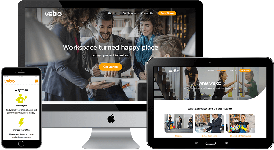
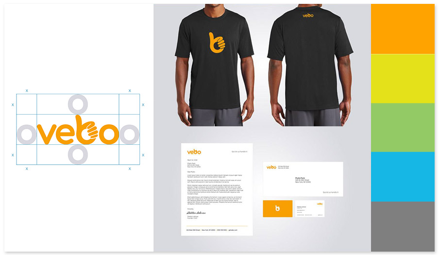
The assets developed in the content strategy phase set the stage for the brand identity development, which included voice and messaging, logo development, typeface, color palette and image direction. It was essential to both Squeaky and Vebo that the aesthetic of the brand was clear, easy to understand and aligned with the content strategy tenets: friendly, smart, direct and confident. We also created the brand tagline - "Workspace turned happy place" - based on these principles, which set the tone for the website design and development phase.
WEBSITE DESIGN & DEVELOPMENT

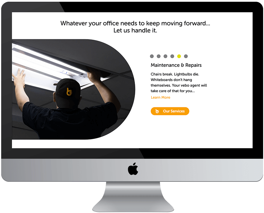
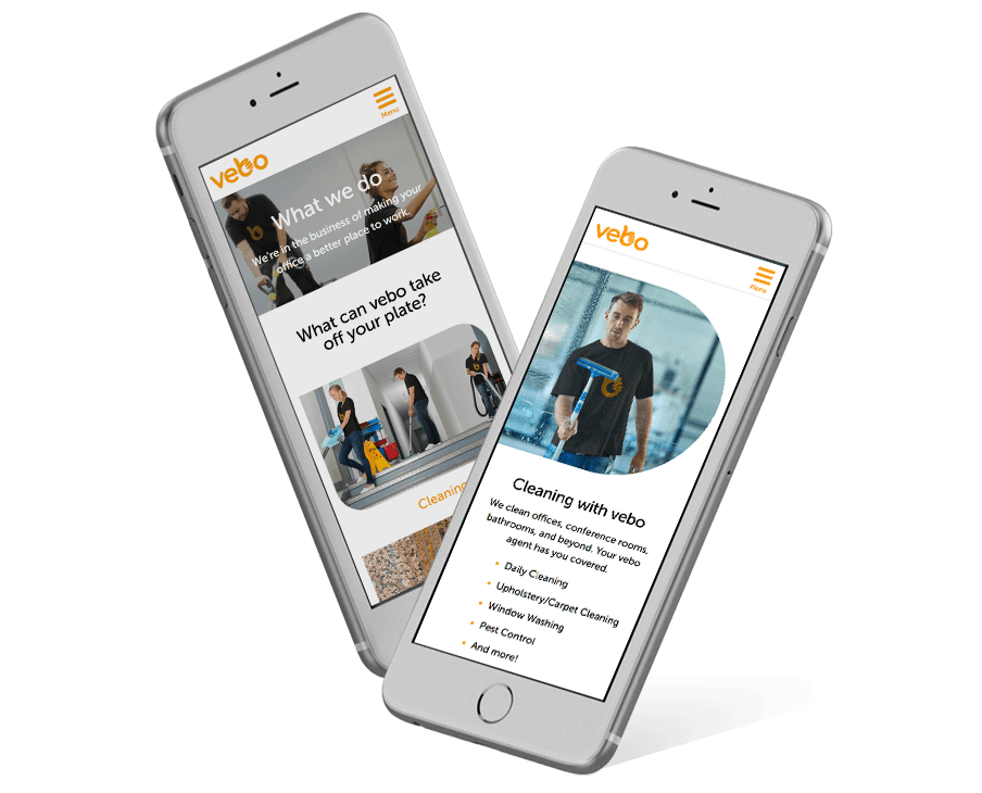
In order to bring the content strategy and brand development to life on the website,we focused on a design that incorporated design elements inspired by the logo, such as the introduction of rounded shapes and carefully selected lifestyle imagery, that would bring the brand closer to the users, allowing the entire experience to feel approachable and authentic.
We also introduced development elements that make the visitor feel as though they are a part of the experience, such as the fade scrolling that opens new elements that help to tell the story of Vebo as a visitor scrolls down the page keeping the user engaged and interested to learn more.
We also introduced development elements that make the visitor feel as though they are a part of the experience, such as the fade scrolling that opens new elements that help to tell the story of Vebo as a visitor scrolls down the page keeping the user engaged and interested to learn more.


